CENSUSDATA.GOV
SPECULATIVE PROJECT WITH GENERAL ASSEMBLY DC

ROLE: UX Generalist
TIMELINE: 2 week
TOOLS: Surveys, Balsamiq
SKILLS: User research, Sketching, Wireframing, Prototyping, Concept Development
METHODS: Interviews, surveys, sketching, wireframing, prototyping
INTRODUCTION
Every 10 years, the Census Bureau attempts to count every individual living in the United States in order to inform funding decisions and policies that will best serve the projected needs of a community depending on population changes over time.
THE CHALLENGE
Finding a way to increase knowledge and participation in the Census.
PROJECT GOALS
1. Discover what people want to know about the Census to build meaningful features
2. Find a solution that would be educational and inspire participation
FINAL DELIVERABLES
-
Prototype on Balsamiq
DISCOVERY
STARTING WITH ASSUMPTIONS
I sketched out what I personally believed contributed to the lack of knowledge and participation in the Census. This helped me guide my research to fill in my own gaps in knowledge and gave me assumptions to check against or validate during user interviews.

USER INTERVIEWS
The process started with 10 interviews (6 men, 4 women) who were varying ages ranging from 26- 69. These were conducted over the phone, in- person, and through Zoom.
During the interviews, I was most curious about three broad topics:
1. How users learned about current events
2. Experiences filling out or learning about the Census
3. What people wanted to know about the Census
KEY TAKEAWAYS
-
Only 2/10 of my users had filled out a Census during their lifetime
-
There was misunderstanding and controversy over the citizenship question
-
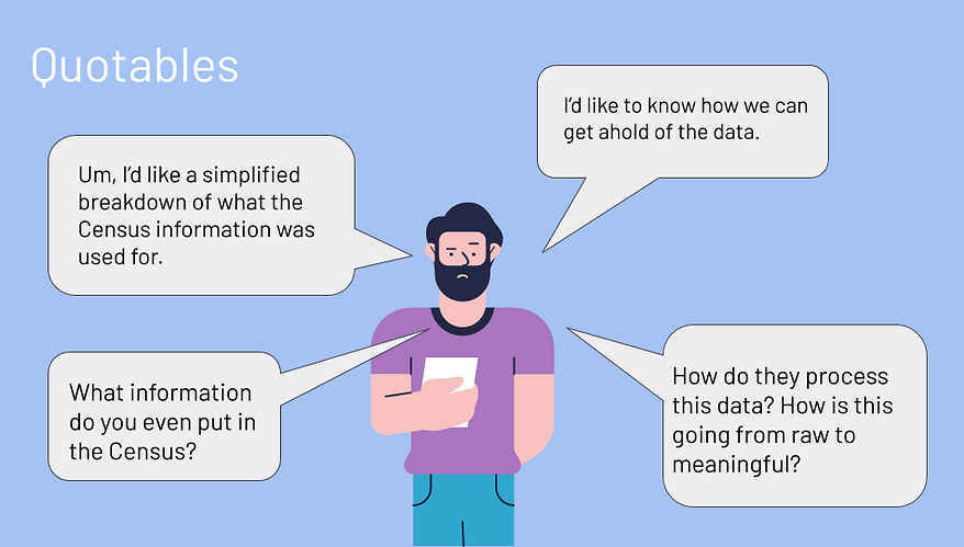
There was a general confusion about what the Census did
-
There was an inability to access and interpret the data in a quick and efficient way
In short, there was a general lack of knowledge about what the Census did and how people could access and interpret this data. There was also a lot of misinformation going around and the lack of most people's experiecnces with the Census probably contributed to this general confusion since only one member of a household needs to fill it out.

SURVEY
To follow up on the interviews I conducted, I created a survey to find out what kind of datasets people would be most interested in seeing. I received a total of 22 responses and learned that people were most curioust about:
-
Population and Socioeconomic changes over time (tied with 19 votes)
-
Breakdown of where federal funding went (18 votes)
-
Property values (17 votes)
In addition, people were most interested in seeing County Data, followed by State Data and then Town Data.
IDEATION
SKETCHING & PEER FEEDBACK
I really enjoy Spotify's "Year in Review" feature and envisioned a similar feature that would give census takers a fun, informative overview of their local communities. Afterwards, users would be encouraged to download an app called Infographics.Gov that would show them data visualization charts created from data collected by the Census.
After sketching out ideas in my notebook, I transferred some clean sketches onto a paper prototyping template so that I could conduct some usability tests and get feedback on the concept.


FEEDBACK RECEIVED
I did some informal testing with this paper prototype with three other classmates which led me to completely changing the original concept I had in mine. In short, this was a great concept with terrible execution.
The idea of visualizing Census data to make it more accessible was well- received and the kind of data I wanted to show was meaningful. In addition, they liked the positive and celebratory tone.
Where did it go wrong?
-
The name Infographics.Gov was a bit confusing since it implied any infographic released by government agencies would be on this platform.
-
Having this feature come up after completing the Census would severely limit the amount of people who would learn about this product since only one member of a household is required to fill it out.
PROTOTYPE
For the final prototype, I made some key changes based on the feedback I gathered from the sketches.
CHANGE 1: The name Infographics.Gov turned into Censusdata.Gov to better reflect the kind of information users would find on the platform.
CHANGE 2: Made the platform available to anyone who was interested in seeing this data instead of having it appear only after a user filled out the Census online.
CHANGE 3: Decided to have users type in a zip code to find their location since it was the quickest piece of information a user could type to find their County.
CHANGE 4: Used survey polling data to determine the order of data visualizations that would appear after a user hit "Search"
FINAL PROTOTYPE


REFLECTION
NEXT STEPS
To improve this prototype and concept, I would want to conduct usability testing to find pain points and then iterate. More features would also need to be built out since I only created one user flow.
LESSONS LEARNED
FAIL FAST
It took me a surprisingly long time to let go of an idea that wouldn't work. However, this was a valuable lesson to start opening up to feedback sooner and failing fast as a way to speed up progress in future projects.